-
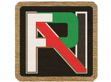
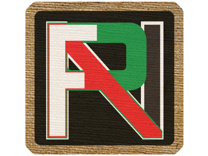
Farina Restaurant
A selection from the varied work created for one of our family restaurants including branding , layout design, web design and signage.
-
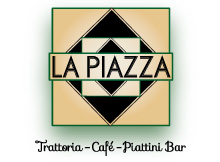
La Piazza Restaurant
The marketing and branding for another family restaurant. I created all branding and marketing, a responsive website, menu layouts and signage.
-
Goose Green Promo
A project for Pochin, a construction company building in Altrincham, to advertise businesses affected by the construction.
-

Epok
Branding for a small business that offers a wide range of personal improvement services through 2 seperate but related identities.
-
Thought Experiments
A hypothetical series of supplements for the Guardian newspaper exploring famous thought experiments and their significance.
-

Bloom
Projects undertaken during my time at Bloom Creative, designing and overseeing the production and installation of signage and marketing materials.
-
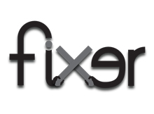
Fixer
Logo design and other work for an entertainment development consultantcy that works with global brands and celebrities.
-

Work for Music
A selection of designs for album art, posters and logos created for clients who work in the music industry.
Farina Restaurant
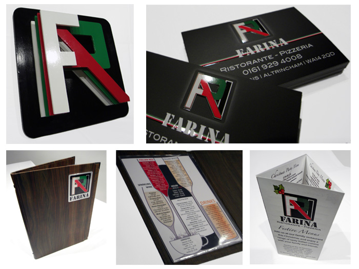
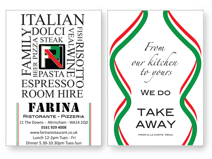
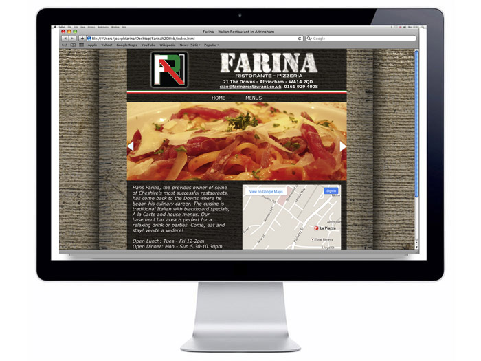
The logo is our family monogram, made by combining all of the letters in the name into one symbol. 'Farina' in Italian means Flour, so the visual motif of hessian sacks of flour, the bright colours of the Italian flag and the stenciled font. I designed and saw through the production and distribution of all printed materials including menus, vouchers, adverts and even hand built a 3D sign of the logo for the frontage. I also created and maintained the website, Google, Facebook and Twitter accounts as well as working as the front of house manager.
When we sold the business and moved to La Piazza, I managed the transfer of all digital assets to the new owners and worked with the new management to streamline the hand over.
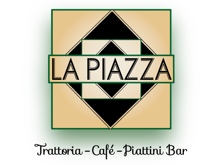
La Piazza Restaurant
La Piazza translates as "The Square" from Italian, so I used a repeating square as a visual element to create a logo that is clean and modern but has tradtional, classic associations. I find it reminscent of the patterned tiles in a continental kitchen. I created all the printed materials required of a restaurant and designed menu layouts that presented the items effectively and aesthetically and worked with the printers to ensure the quality of the final product.
I also manage the web presence of the restaurant, ensuring menus are available online in browser-friendly formats and that the branding across all platforms is consistent. I designed the website to be responsive, resizing elements and adjusting the layout appropriately according to the device its being viewed on. We chose to keep the website minimal to provide essential information and encourage users to engage on social media as well as maintiaining the 'clean' aesthetic.


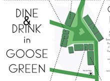
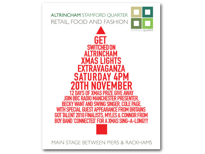
Goose Green Poster
This poster design was the result of a collaboration with Pochin, a construction company that was working on a site that affected the surrounding businesses. The site office had a prominently positioned window and they recieved requests from various businesses to advertise in that space. I offered to simplify the situation by producing a single poster that featured all the businesses affected, which was met with approval.
I undertook all the photography, design and layout and worked with Pochin's Corporate Social Responsibility Manager and the businesses involved to design and populate the poster as well as the signage company contracted by Pochin to print it. I wrote any copy that wasn't provided by the businesses and ensured their branding was utilised.

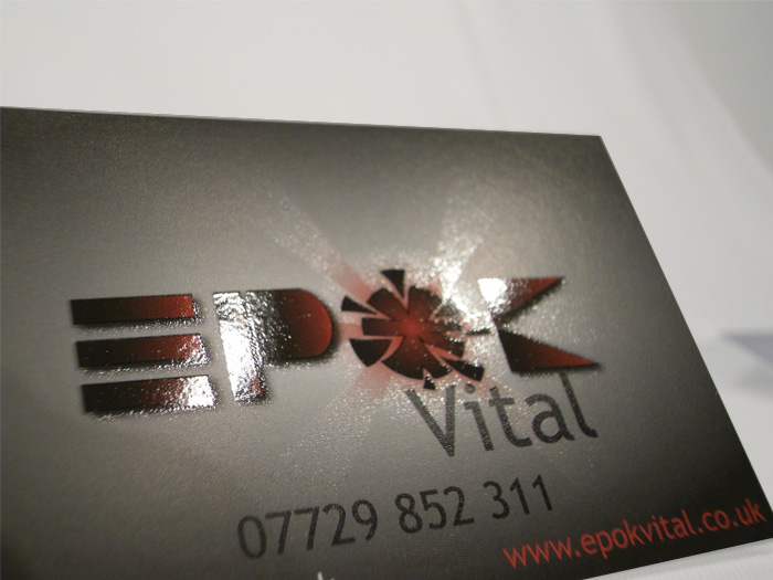
Epok
Epok offers a range of services including personal training, life coaching, A-level tutoring and personality type analysis. An 'Epoch' is defined as an instant in time given distinct significance, which is the driving concept behind the personal improvement offered. I wanted the logo to evoke change and to be energetic but also disciplined and structural. The O is going supernova or resembles a hatching egg, symbolising an awakening.
I used the same logo but a different colour scheme across the 2 platforms that Epok delivers, Epok Vital for fitness, health and coaching and Epok Academy for tuition. I produced business cards that featured a spot UV finish and designed and coded the websites. I created the initial logo and sites in 2010 and learnt alot about coding html and css.


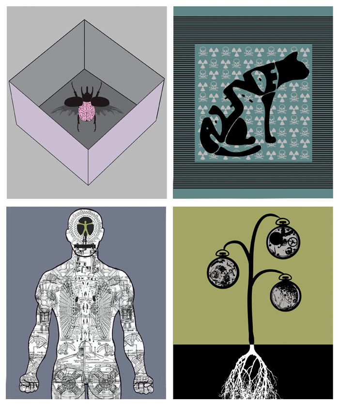
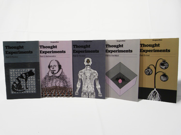
Thought Experiments
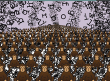
This project involved me creating a series of images to be used as covers for a hypothetical supplement for the Guardian. I researched many philosophical, scientific and mathematical thought experiments and chose what I considered the most fruitful for interesting compositions and content. I incoroprated the Guardian's distinctive font and style to mock up printed booklets.
I had the infinite monkey illustration chosen to be entered into Mr Thomas' Art Fair, a charity auction of work for the North West Air Ambulance, where it was sold as a limited edition print.
The Infinite Monkey Theorem: An infinite number of monkeys at an infinite number of typewriters will eventually write the entire works of Shakespeare.
Wittgenstein's Beetle: We all have a beetle in a box and we can only see inside our own boxes. The beetle is an analogy for the mind, we have no way of knowing that what we see is the same, only that we call it the same thing.
Schrodinger's Cat: In the Copenhagen interpretation of Quantum mechanics, an unobserved cat with a 50/50 chance of survival is both alive and dead simultaneously.
The Homonculus: A tiny version of yourself in your own brain controlling the 'machinery' of your body.
Paley's Watch: The complex inner workings of a watch necessitate an intelligent designer, as with a watch, the complexity of any given subject in existence implies a designer and therefore the existence of God.

Bloom
I worked with Bloom creative, a local creative agency creating a range of work for clients in the town. Other than working on the designs I also liased with specialist printers to install vinyls on shop windows as part of an initiative to improve the appearance of the town center. I offered clients a range of options to suit their budget and worked with them personally to ensure they were happy with their final product.
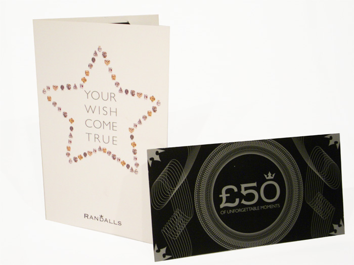
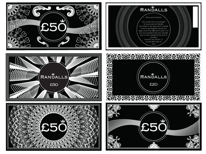
Some clients included outlets for national brands and I had to be capable of producing work that was inline with their style guidelines. I particularly liked making vouchers for a local jewellery outlet, it taught me alot about getting the best value for money on a project and ensuring appropriate print finishing. Shown are some of the alternative designs I considered.

Fixer
I created this business card logotype for Fixer, an entertainment development consultancy. They 'fix up' meetings and events and I used the type to show this idea of introductions and bringing people together.
Follow up work has included posters for events, photo manipulation and retouching and creating promotional materials.


Work for Music
I designed the cover and interior layout for a zine called Bricolage Music with journalist Sam Breen. I also made the pencil music note image for his twitter account.
I created the logo and album cover for James Kruman a singer songwriter from Middlesborough.
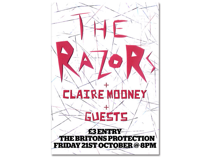
When I played in a band called The Razors, I designed all the posters, flyers and cd covers. I play several instruments and enjoy making music.